We were tasked with developing a brand identity for a newly established Irish e-learning company named QedON. This company specializes in offering international learning courses tailored for universities, businesses, and individual customers.
The objective outlined in the brief was to craft a versatile brand identity that could seamlessly extend across various platforms including the website, e-learning materials, and corporate assets.
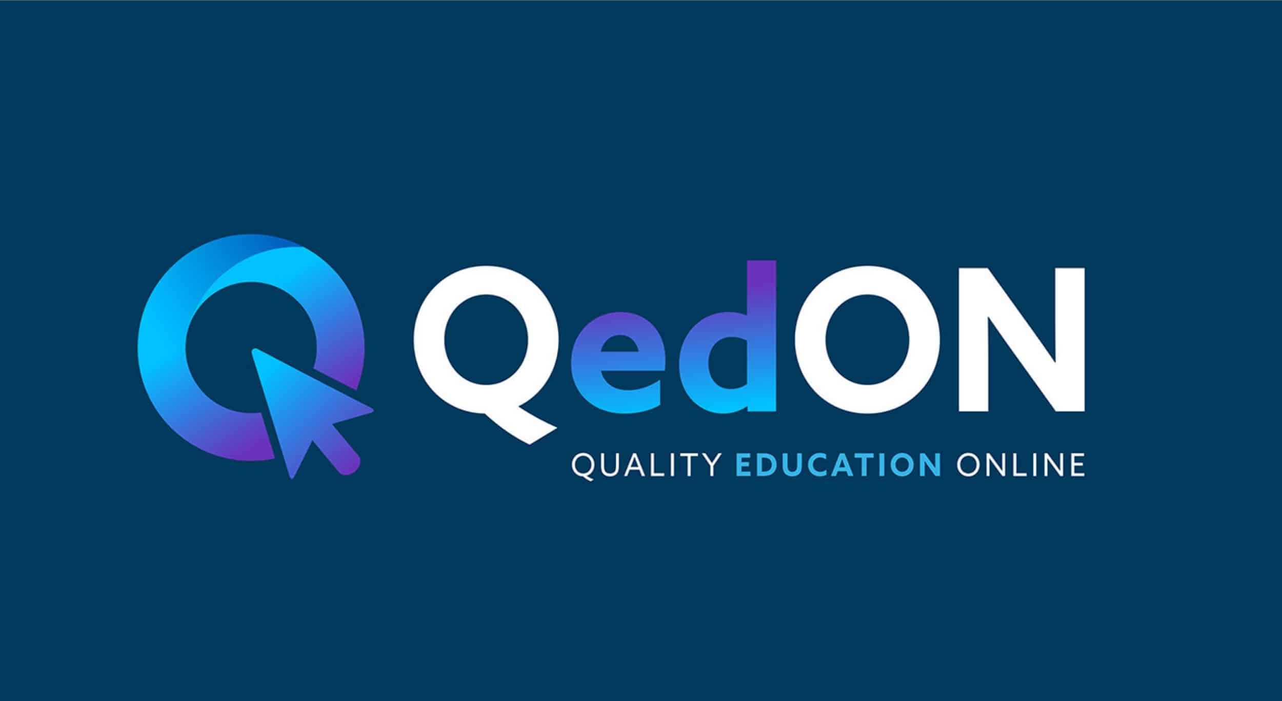
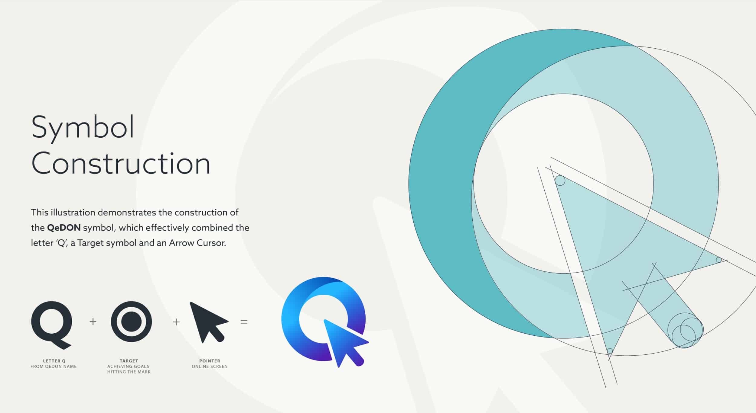
Our approach involved conceptualizing a distinct icon centered around the letter ‘Q’, which served as the company’s initial. Within this icon, we incorporated a subtle online arrow cursor to signify the digital learning aspect. Additionally, we strategically color-coded the letters ‘ed’ to highlight the importance of education within the brand.
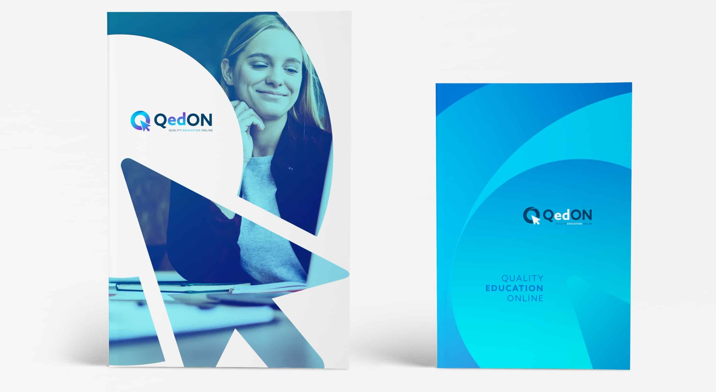
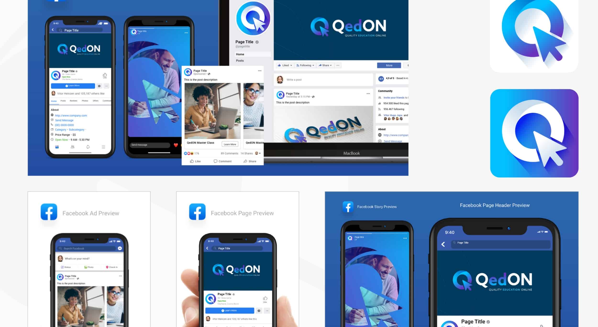
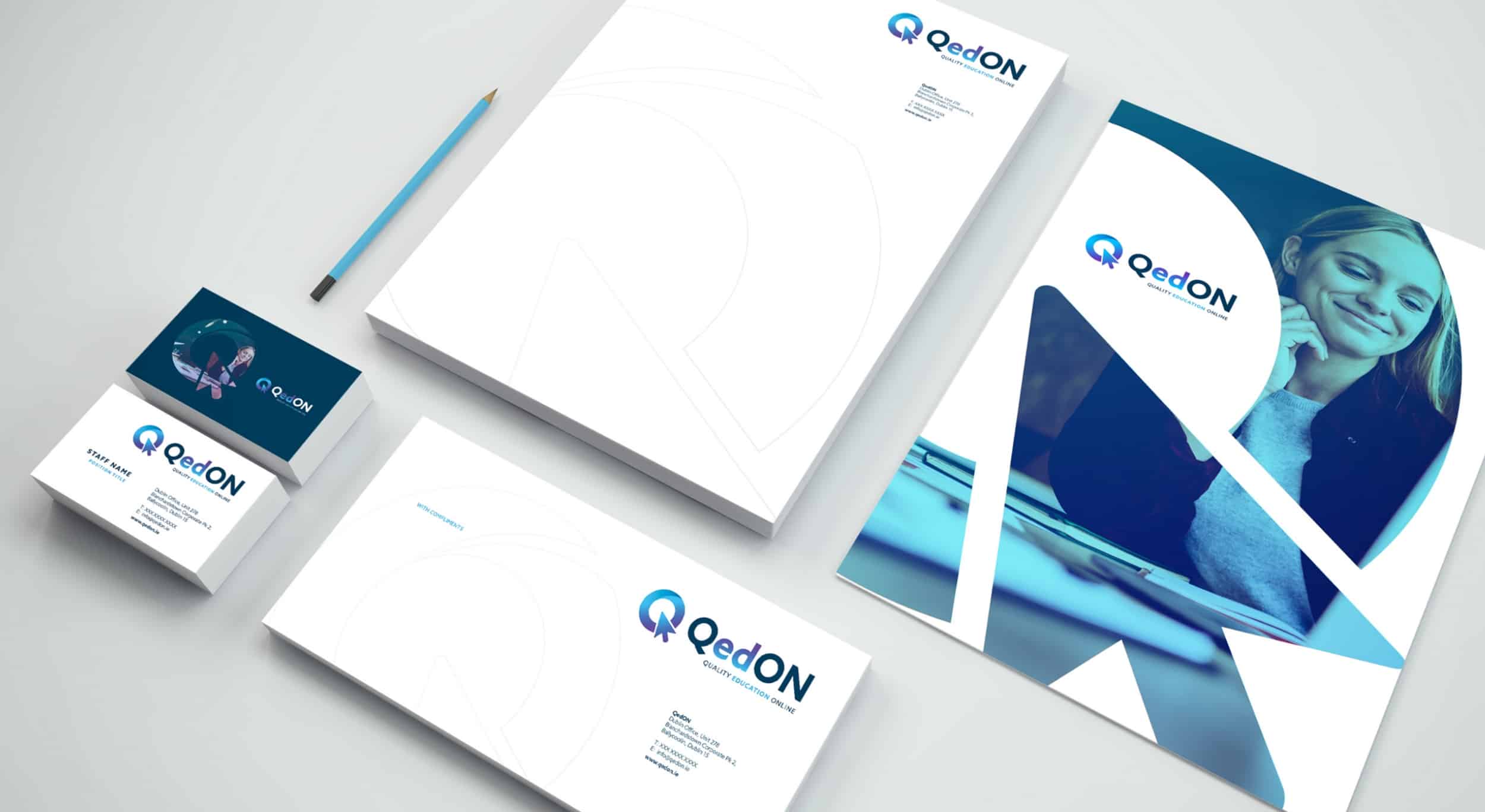
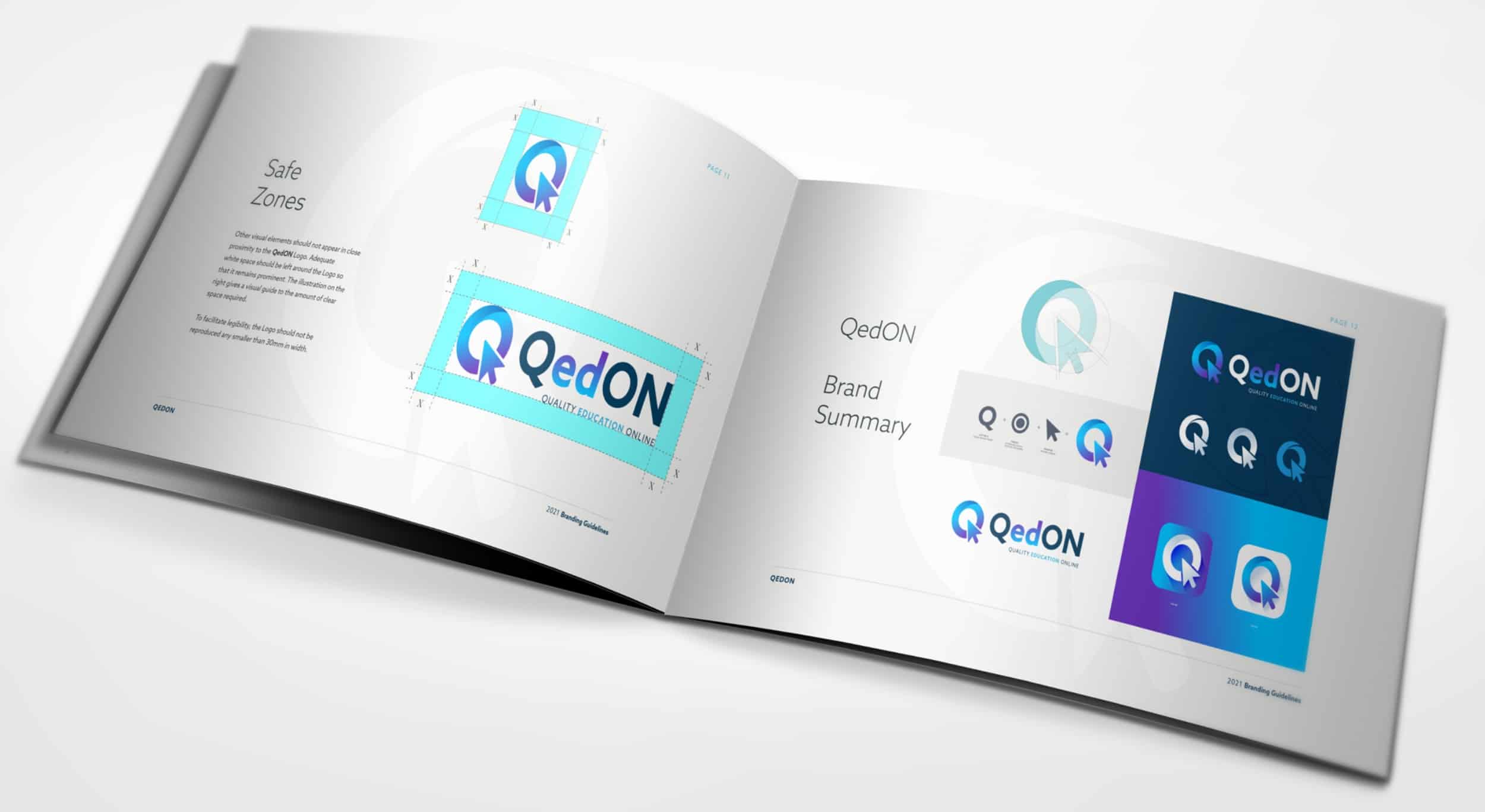
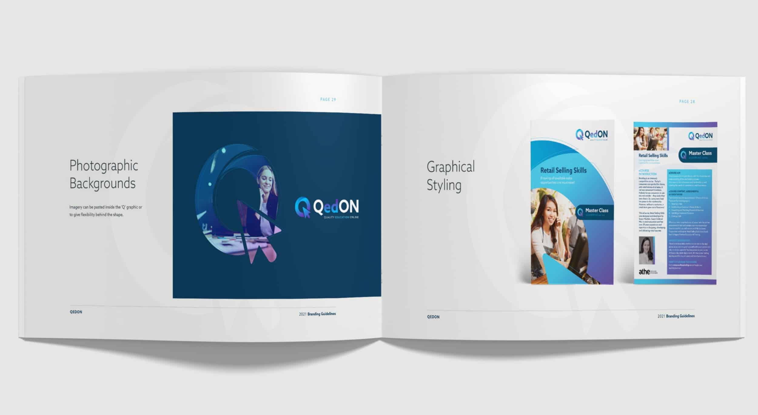
Once the design concept received approval, we proceeded to implement it across a range of materials, including a comprehensive corporate identity guidelines manual, product specification sheets, PowerPoint presentations, stationery items, and signage materials. This ensured consistency and cohesion in conveying the QedON brand identity across all touchpoints. Checkout their online presence: QedON